LOGO
Why doesn't anyone like their logo?
Logo is the first design: the first marketing item that every business buys and the first thing that beginner designers practice on. Since this service is the most traded, it has become a substitute for designer pedigree – you are only as good as your logo portfolio. However, creating a logo is more than just design – it’s also conceptual brand direction and sales. These are all big words that have to be broken down on a very small number of pixels, while at the same time respecting the technical requirements of the design of a logo.
Almost no one gets it right the first time. One of the most recognizable and evocative logos in the world is Nike swoosh. Any client would love such a logo and any design team would love to make it. However, swoosh started out as a failure. Phil Knight declined the logo several times, until designer Carlyon Davidson dropped the changes and sent an invoice. Only then did Nike have to put one of the proposed variations of the logo on the sneaker.
A client who doesn’t like the logo is a rule rather than an exception. It has nothing to do with the design of the logo, although the first instinct is to change something and maybe it will work. It has to do with understanding exactly what you’re buying: Nike, swoosh, or the two lines between which is the color red. I hope this article will help in understanding this.
The hardest part is simplicity
Each logo must be clearly visible. This means that you will recognize the logo even from the corner of your eye, even if you have a prescription, even if it is far away. To be visible, the logo must be simple. However, when a designer delivers a simple design, everyone first thinks: so what is it that you designed here? If you don’t believe me, just Google all the memes that came out when Uber rebranded in 2018.
There is a famous story when Steve Jobs hired a design legend named Paul Rand to design the Next company’s logo. Jobs laid out his brief. Rand asked sub-questions and decided that was all he needed. Jobs reached out his hand and said, “Okay, then I’ll see you soon with some options.” Rand replied, “I don’t think you understand how this works. You told me your problem and I’ll give you a solution. You’re going to pay for that solution. If you want options, talk to other people.
While not overly helpful, Rand is fundamentally right: design is basically problem solving. The problem that the logo solves is to ensure the distinctiveness of the product in relation to the competition, in a recognizable way. Everything else is redundant. That’s why the story of the biggest logos in the world is a story of decades of great ambition and millions of dollars spent to get to what the profession claims to be the best: Simplicity.
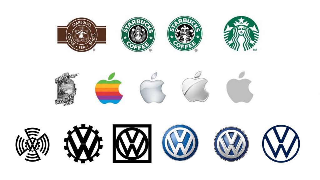
Evolution of Starbucks, Apple and Volkswagen Logo
In everyday life, we are used to simplicity preceding complexity. In business, it’s the other way around. We want everything, we want everyone to agree. It’s no coincidence that the method for focusing on innovation is called design thinking. Simplicity is a triumph over complications.
Logo needs to work
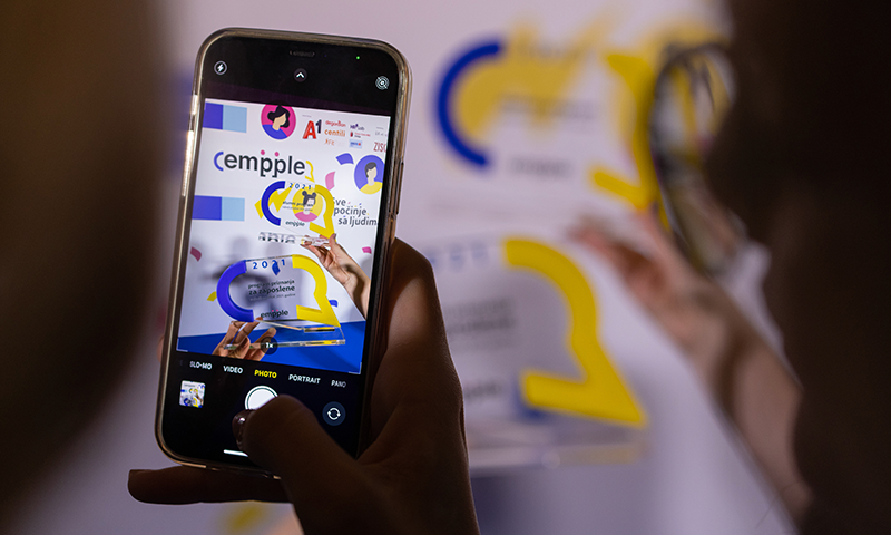
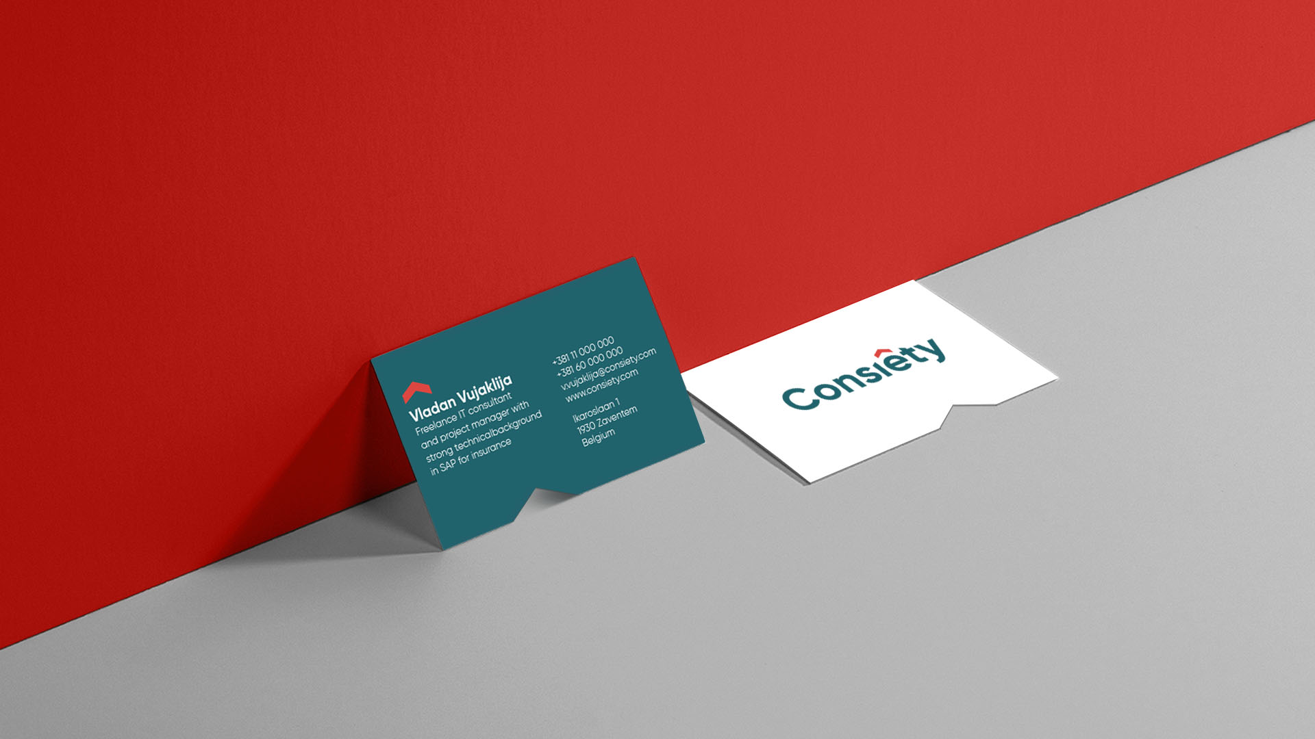
Everyone knows they’ll need a business card, a website and a memo. However, the logo must work on all applications: your browser currently has a favicon, a small Z icon that has 80×80 pixels. Every site has this icon and it needs to be clear, even on such a small number of pixels. And when we made the logo for the Empple festival, we thought not only about the site, but also about how it will look on large formats of the branded stage.
Logo doesn’t have to carry a message
If bought when starting a business, usually all the hopes and dreams that founders have for that business are tied to the logo. If it is purchased for a built business, then clients want the logo to tell the already existing story of that brand.
This often leads to bad logos. It is easiest to evoke using elements that are currently modern. If you don’t believe me, google Hipster Logo Generator. However, a good logo is timeless. Another way is to add symbolic details, which only impairs visibility. Worst of all, the idea itself is wrong at first: the logo should not evoke your brand.
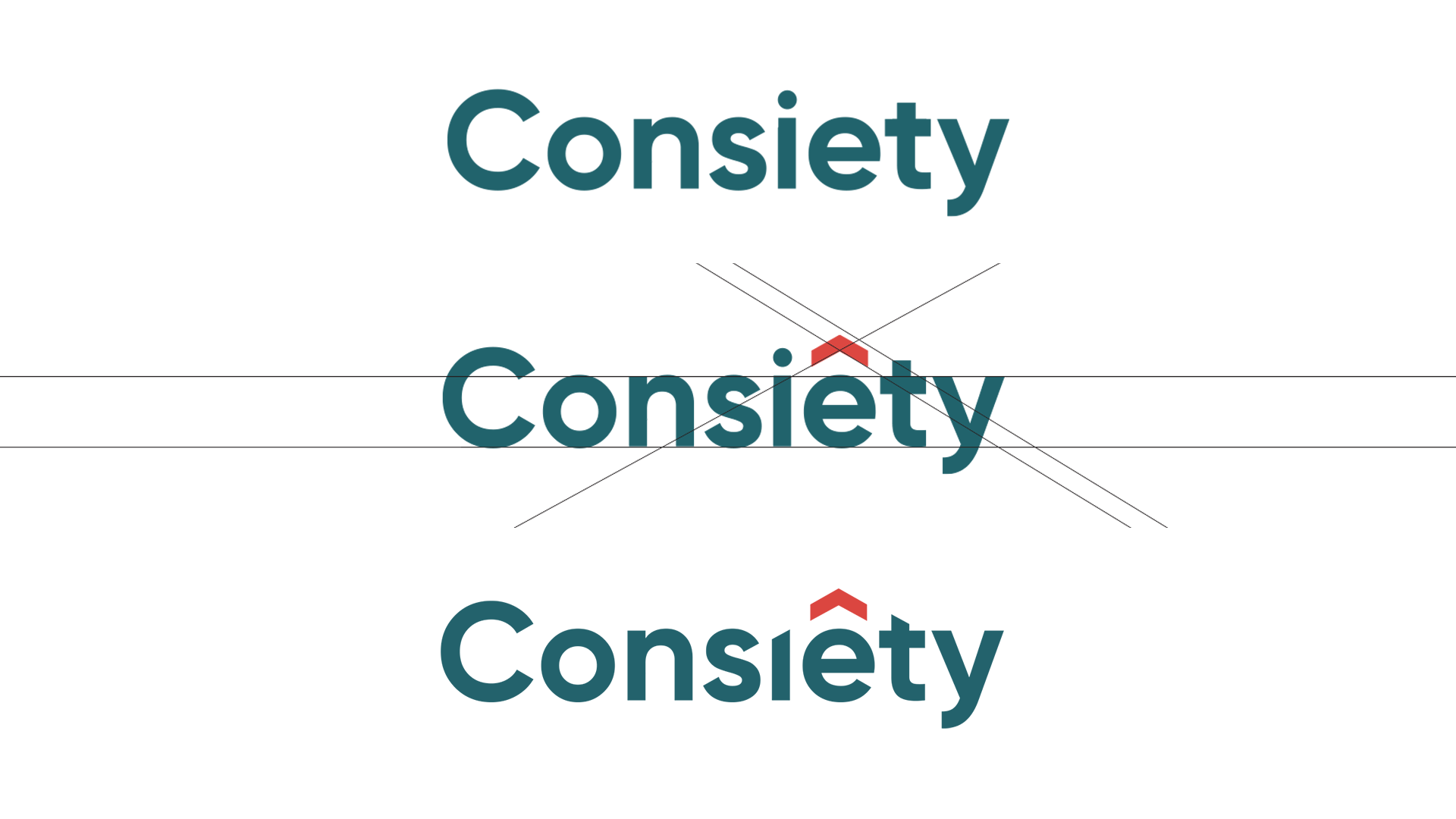
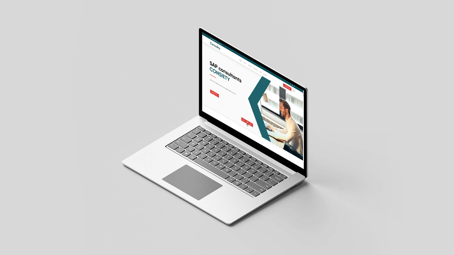
A completely realistic option is a logo, that is, a logo that is made from the company’s print in some font with minor changes, as we did for Consiety:
But the logo can carry a message
Behind the simplest signs are sometimes complicated explanations; every detail has a story behind it, and symbols appear somewhere in the famous negative space.
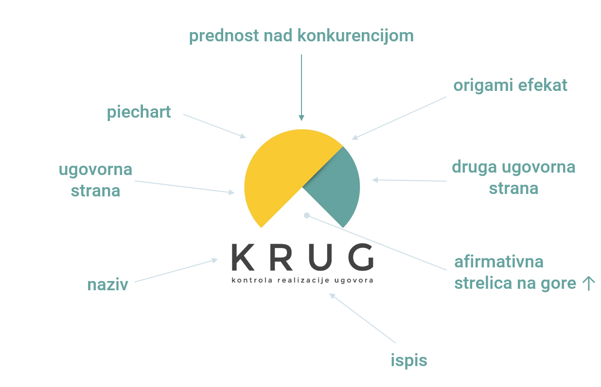
When we were working on the sign for the Krug (Circle) software solution, we tried to do everything but the ordinary circle. It would be too easy. In the end, we came up with a simple piechart-based sign that has a rationale for each element.
The message is in the eye of the beholder
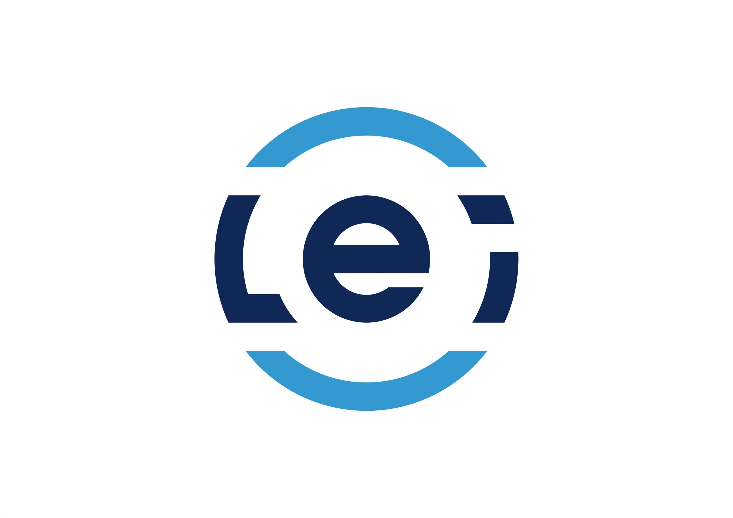
When we made the sign for LEI, an index that measures the development of administrations in Serbia, we wanted a solid sign and we did not think much about the message. When we presented the sign, the client also saw the steering wheel in it, which is convenient because we are talking about management and leadership. We nodded wisely as if our desire was to present the steering wheel.
Communication makes the logo evocative.
When you see a swoosh you imagine Michael Jordan nailing a free throw, or maybe you’re singing “I only wear the check mark brand.” But it wasn’t created by two curves between which was a space filled with red. This is the result of Nike communication and products over the last 40 years.
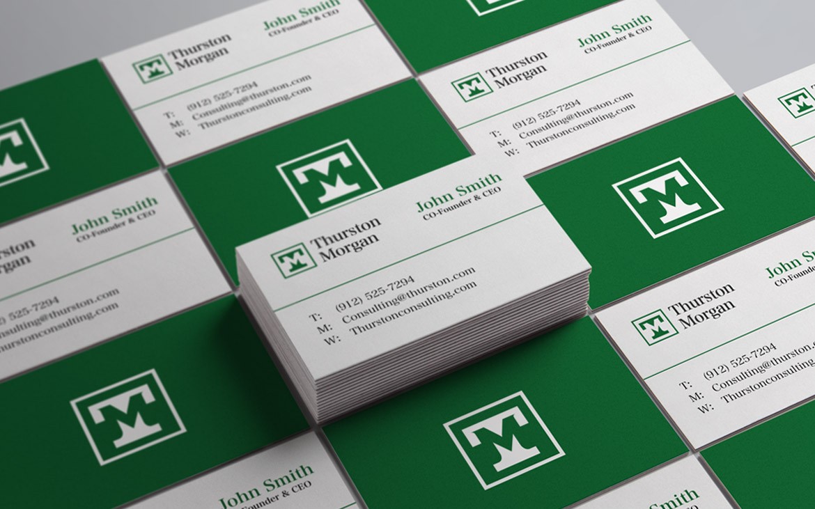
The best thing a logo can do is to have a style. For example, our client Thurston Morgan is a financial consultant who targets somewhat more conservative clients. For them, we wanted to evoke the bankers of the Gatsby era:
Maybe this logo evokes the old charm of New York bankers of the ’30s. Perhaps not. But it was objectively done in that style.
/ / /
This is not a comprehensive guide to logo design. In fact, this is only the first step, which is enough for one blog.
In some of the next steps, maybe you’ll need the logo extension. And that’s a whole other can of worms.
However, if you understand these principles, you’ll have a better chance of getting in touch with the designers who will make your logo – whether it’s us or someone else.
Good luck!


